Scatterplot in regl

During our biological data visualisation workshop at the EBI I was made aware of a javascript library that makes it straightforward to create scatterplots of large datasets. How large? The demo at https://flekschas.github.io/regl-scatterplot/ includes an example of 20M datapoints. That library is regl-scatterplot which is available at https://github.com/flekschas/regl-scatterplot, and based on regl which "simplifies WebGL programming by removing as much shared state as it can get away with".

regl-scatterplot uses the GPU to do this, but does have very specific restrictions. These mainly result from the fact that data to be plotted is encoded in an array of up to 4 elements, because they are actually encoded as R, G, B and A values. In addition, these values have to be rescaled between -1 and 1 before using them.

Below an example:

+page.js
 1
 2
 3
 4
 5
 6
 7
 8
 9
10
11
12
13
14
15
16
17
18
import Papa from 'papaparse'

export const load = ({ fetch }) => {
  const fetchFlights = async () => {
    const res = await fetch('http://vda-lab.github.io/assets/flights.csv', {
      headers: {
        'Content-Type': 'text/csv'
    }})
    let csv_data = await res.text()
    let csv_parsed = Papa.parse(csv_data, {header: true})

    return csv_parsed.data
  }

  return {
    flights: fetchFlights()
  }
}
+page.svelte
 1
 2
 3
 4
 5
 6
 7
 8
 9
10
11
12
13
14
15
16
17
18
19
20
21
22
23
24
25
26
27
28
29
30
31
32
33
34
35
36
37
38
39
40
41
42
43
44
45
46
47
48
49
50
51
52
53
54
55
56
57
58
59
60
61
62
63
64
65
66
67
68
69
70
71
72
73
74
75
76
77
78
79
80
81
82
83
84
85
86
87
88
89
90
91
92
93
94
95
96
97
<script>
    import createScatterplot from "regl-scatterplot";
    import { scaleLinear } from "d3-scale";
    import { extent } from "d3-array";
    import { onMount } from "svelte";

    export let data = [];

    const width = 800;
    const height = 400;

    $: xScale = scaleLinear().domain([-180, 180]).range([-2, 2]);
    $: yScale = scaleLinear().domain([-90, 90]).range([-1, 1]);
    $: rScale = scaleLinear()
        .domain(
            extent(
                data.flights.map((d) => {
                    return +d.distance;
                })
            )
        )
        .range([0, 1]);

    $: points = data.flights.map((d) => [
        xScale(d.from_long),
        yScale(d.from_lat),
        d.from_country == d.to_country ? 0 : 1,
        rScale(+d.distance),
    ]);
    let full_points = {}
    $: data.flights.forEach((d,i) => {
        full_points[i] = d
    })
    // $: console.log(points.map((d) => { return d[3]}))

    const dataFlow = ({ points: index }) => {
        canvas.value = index; // Array.from(index, (i) => points[i]);
        canvas.dispatchEvent(new Event("input"));
    }

    let canvas;
    let scatterplot = undefined;
    let selectedPointIDs = []
    let selectedPointID = undefined
    onMount(() => {
        scatterplot = createScatterplot({
            canvas,
            width,
            height,
            // opacityBy: 'density',
            opacity: 0.4,
            colorBy: "value1",
            pointColor: ["#4682B4", "#ff0000"],
            sizeBy: "value2",
            pointSize: points.map((d) => {
                return d[3] * 10;
            }),
            // cameraDistance: 1,
            // cameraRotation: Math.PI/4,
            // showReticle: true,
            // reticleColor: "rgba(1,0,0,1)",
            pointOutlineWidth: 2,
            xScale: scaleLinear().domain([-180, 180]).range([-2, 2]),
        });

        // console.log(points)
        scatterplot.draw(points);

        // dataFlow({ points: [] });
        scatterplot.subscribe("select", (d) => { selectedPointIDs = d });
    });
    // $: console.log(selectedPointIDs.points)
    $: { if ( selectedPointIDs.points ) { 
        selectedPointIDs.points.forEach((d) => { console.log(full_points[d])})}}

</script>

<h1>Flight dataset</h1>
<canvas bind:this={canvas} {width} {height} />

{#if selectedPointIDs.points}
<ul>
{#each selectedPointIDs.points as point_id}
<li>{JSON.stringify(full_points[point_id].from_airport)}</li>
{/each}
</ul>
{/if}


<style>
    canvas {
        width: 100%;
        height: 100%;
        background-color: #000;
        border: 1px solid;
    }
</style>

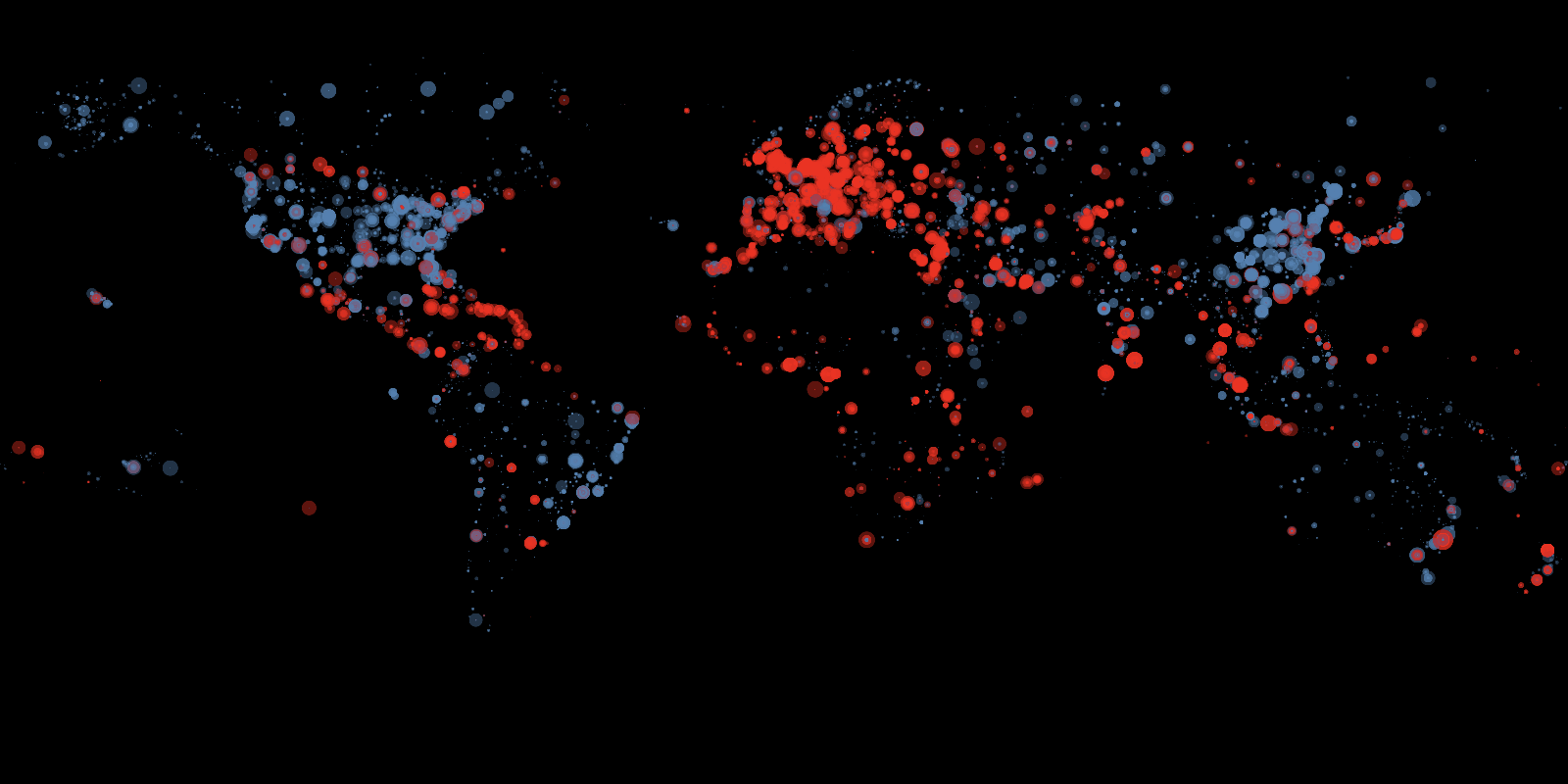
This is what the output image looks like:

regl flights
Figure 2. Output image

Some comments on the code:

  • line 24-29: Here we create the actual data to be plotted (see line 67).

    • You access the values from the 4-element array as x, y, value1 and value2. So the 3rd element (i.e. if a flight is domestic or not) is value1.

  • line 60: I do not have the reticle working yet. For some reason it does not show when set to true.

  • line 52-53: Colour is set by domestic/international, which is in value1. As there are 2 possible values, we set the pointColor as an array with 2 elements.

  • line 54-57: In a similar way we use the distance value2 for the radius. Here, we use a function for pointSize instead of a fixed array as for pointColor.

  • line 108: With this subscription we capture the IDs of the selected points which we can use like any reactive variable in svelte. The events that can be trigged with a subscription include select, deselect, pointOver and pointOut, etc. See here for a full list.